Design studio · Providence, Rhode Island

Brands worth pinning down.

Moth & Mortar is a design studio in Providence, Rhode Island. We look closely at what makes a brand strange, pin it down, and build the identity, packaging, website and print that hold it there.

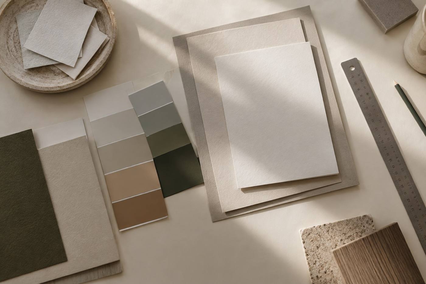
Paper stock samples, colour chips and a steel ruler arranged on a studio worktable
On the bench — paper stock, colour chips, steel rule

Selected drawers

Cases, pulled open.

Three drawers, shown the way we build them: what gets scoped, what has to stay strange, and what you end up holding.

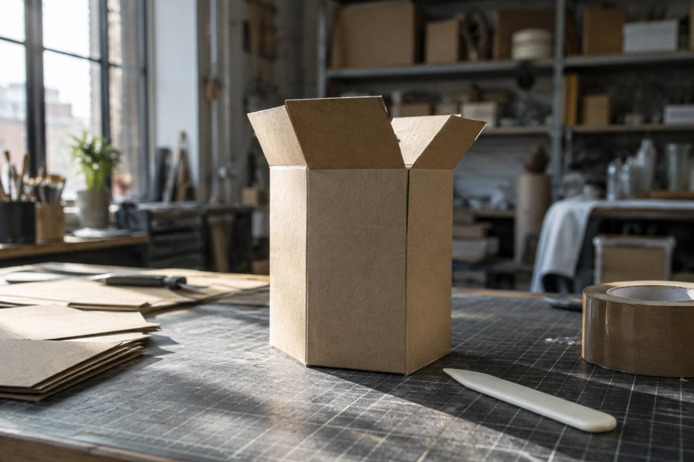
An unprinted cardboard carton prototype standing on a cutting mat in the studio
Structure test — carton prototype on the bench

01 — Brand identity & packaging

Identity & packaging

We start by asking what is genuinely odd about the thing being sold, then build the mark, palette, type system and voice around it. The packaging is the first thing anyone touches, so it has to be worth opening before a word is read.

Scope Brand identity and packaging design — strategy, logotype, palette, type system, voice, cartons and closures.
Lives in Shelves, cartons, closures, and the first three seconds of a stranger's attention.

Start a project
A designer sketching layout blocks on blank paper at a studio desk
Layout blocks, first pass — before anything is built

02 — Web design

Web design

A website is a drawer with a thousand compartments. We label every one before we build, so the sitemap, hierarchy and type keep their composure from a wide desktop down to a phone in a coat pocket.

  • Sitemap
  • Layout
  • Type on screen
  • Interaction
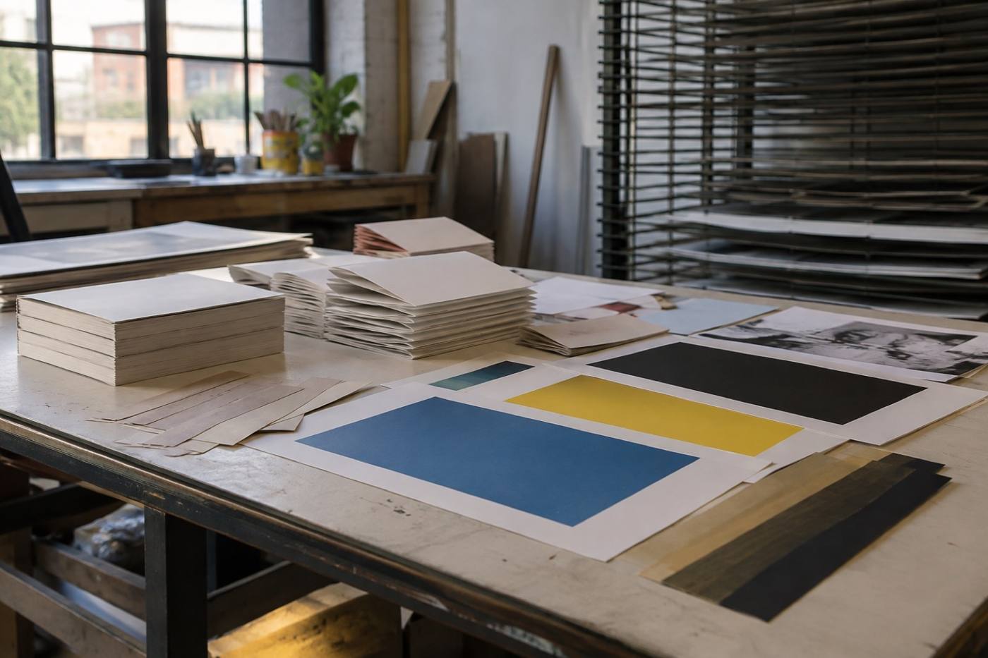
Printed sheets and ink test prints drying on a studio table
Colour tests drying before the final run

03 — Art direction & print

Art direction & print

Art direction is how a collection is lit. We direct the shoot, choose the stock and the ink, and finish the piece so it reads the same at arm's length and across a room.

  • Photography
  • Styling
  • Stock
  • Ink
  • Binding

What we do

Five keys.
One collection.

Five disciplines, grouped by what they hold rather than how they are sold. Most projects need more than one.

Method

Every ambitious brand is a specimen.

Four moves, in order, on every drawer we open: survey, pin, label, mount. The work stays on the bench until each one is done.

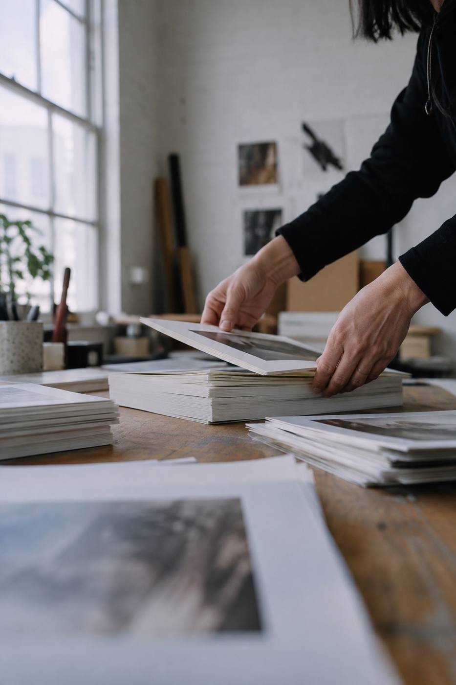
Hands sorting a stack of printed sheets into piles on a studio bench
On the bench — sorting printed work before mounting
  1. 01

    Survey

    We read the market, the shelf, and the archive box of everything you have already made. Somewhere in there is the trait worth keeping.

  2. 02

    Pin

    We choose the one strange thing a brand can own, and pin the whole system to it — mark, palette, type, voice, structure.

  3. 03

    Label

    Strategy written plainly enough to say out loud, so every future decision can be checked against it without calling the studio.

  4. 04

    Mount

    We build the system across identity, packaging, web, art direction and print, then hand over the keys and stay on the bench for what comes next.

Empty drawer

Bring us something worth pinning down.

Tell us what you are building, what is strange about it, and where it has to live — a shelf, a screen, a folded card, all three. Identity, packaging, web, art direction and print all start the same way.

Studio · Providence, Rhode Island

What happens next

  • 01

    You write

    A paragraph is plenty: what you are building, who it is for, and when it needs to exist.

  • 02

    We ask

    We come back with questions — what is fixed, what is negotiable, and what is worth pinning down.

  • 03

    We scope

    Scope, sequence and fee, written plainly, before any work begins.