Copper Finch Studio builds brand identity, packaging and art direction for startups — a mark that reads from across the street, and a system that holds up on the shelf.
Every package runs in order, from the mark to the box it ships in. One brand that has to work on a shelf, a screen, a sticker and a mailer.
01
Brand Identity
The whole bill. Name, mark, palette, type and voice — and how all of it holds together once it leaves the studio.
02
Logo Design
The headline act. A mark that lands at a glance on a storefront, then still reads when it is the size of a thumbnail.
03
Packaging Design
Boxes, labels, sleeves and bags. What your product looks like when someone picks it up and turns it over.
04
Brand Guidelines
The setlist. Rules for type, color, photography and spacing, written so the brand stays yours after launch.
05
Art Direction
How it gets shot, framed and shown. The look of the campaign, the launch, and everything printed around it.
Packaging & print
What lands on the table.
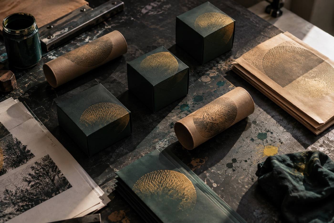
Halftone overprint on cartons, tubes and sleeves
Packaging is the merch table. It is the piece people pick up, turn over and photograph before they ever use what is inside. We design it to survive a bright shelf and a dim bar.
Printed pieces
Cartons & boxes
Labels & seals
Bags & sleeves
Tubes & mailers
Proofs on the table before the run
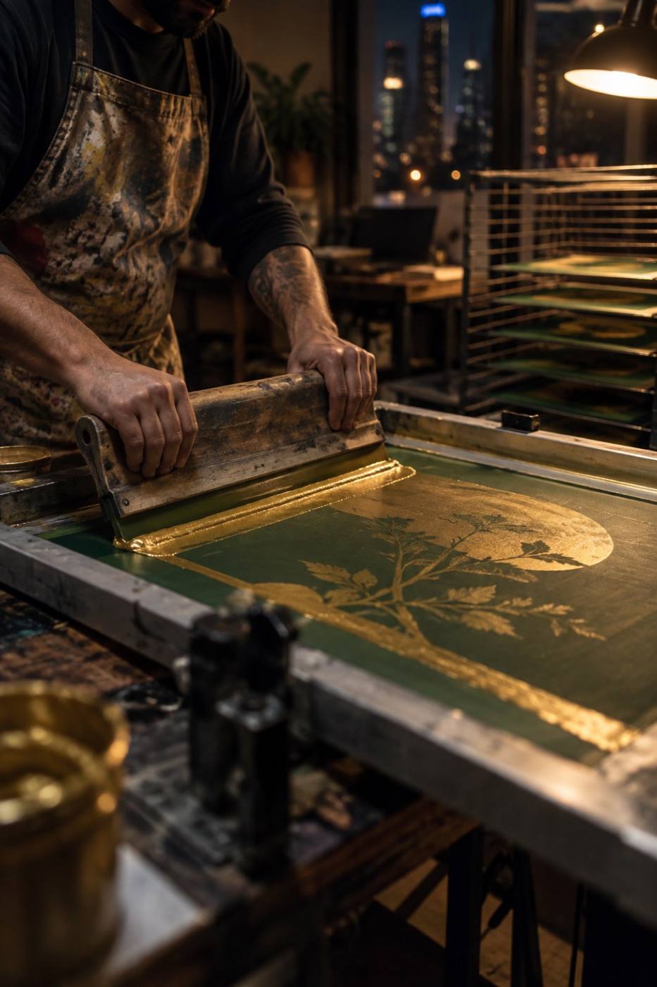
Pulling the second color pass
Process
Four blocks, start to print.
No mystery process and no black box. Four blocks run in order, with you in the room the whole way through.
01
Kickoff
You tell us what you are launching, who it is for, and the day it has to go live.
02
Read the shelf
We read the category you are standing in — competitors, references and what is already shouting.
03
Build the system
The direction gets built out: identity, packaging, and the rules that hold the whole thing together.
04
Launch package
Final artwork, brand guidelines, and art direction for the week you go live.
Contact
Tell us what you are launching.
Send the shape of the project — what you are launching, who it is for, and the date it has to go live. We will come back with a scope and a start date.